Magazine Design
The Brief: To design a trendsetting magazine, using either existing publications or constructing your own. Regardless of the decision the magazine design should incorporate a new set of rules or criteria, which suits the editorial. The final outcome for the project should span a minimum of four-double spreads and contain the masthead, front cover, contents page.
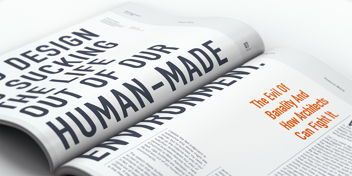
The Concept: I decided to use my own initiative and market knowledge to publish my own magazine. After in-depth analysis into existing Architecture publications, I discovered a unique gap in the market . The theme I decided to pursue for my magazine is based on ‘Bad’ Architectural Design. Using this concept I developed the name of ‘Architorture’. My main focus for the magazine was to highlight a growing trend of ‘Form over Function’. Architects are preoccupied designing shiny icons that they are overlooking the functionality of the building for its occupants.
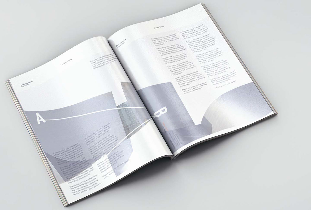
The Solution: In order to portray this concept, I created an abstract front cover consisting of three separate layers. When the reader deconstructs these layers, they find that behind the shiny façade lay hidden design flaws. Although the architectural content is accurate for the reader, the internal spreads are designed to make unnecessary hardship, breaking the rules of how a magazine publication should be structured.

GRID STRUCTURE
These are the guidelines for the magazine. Most of the text columns are 52.3mm wide. The height varies throughout the publication. Each spread is divided into 10 columns with a gutter of 4mm. The spreads are also divided into 10 rows as some spreads will be read both horizontally and vertically. The margins are 15mmx15mm and the spine is 10mm. The header of every page will have a space of 420mm height, meeting the third rule of the spread. Anything below this space will consist of content.

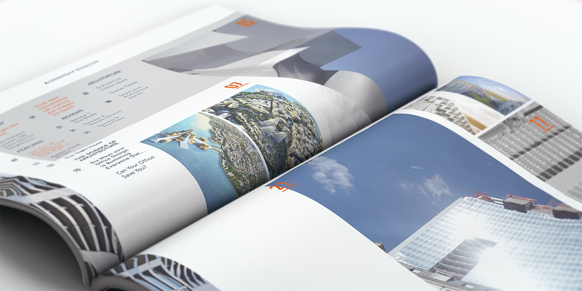
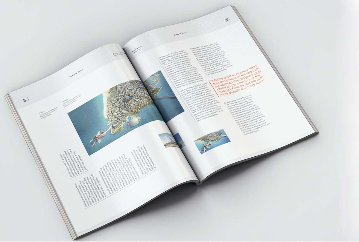
THE SPREADS
Each of the below spreads have been designed to highlight the specific article subject matter. The editorial design of each article reinforces the magazines USP, by breaking the grid structure at every opportunity. Examples of this include horizontal and vertical columns and purposeful disjointing of paragraphs


Thank you


